|
|
Post by Deadlymushroom on Nov 18, 2006 17:09:15 GMT -5
|
|
|
|
Post by Rez Raptor on Nov 19, 2006 11:39:40 GMT -5
hahahaha frog abuser...... anyway the halo one is the best
|
|
|
|
Post by Capton Tenacious on Nov 20, 2006 22:08:30 GMT -5
That's what I said.
The frog abuser is a bit of an inside joke between me and DM by the way...
|
|
|
|
Post by Deadlymushroom on Dec 16, 2006 10:36:31 GMT -5
I added some stuff and more text. Huzzah!
(P.s. Be sure to read text above unfinished section.)
|
|
|
|
Post by Deadlymushroom on Jan 2, 2007 17:23:12 GMT -5
Guess where I made my latest sig.   |
|
|
|
Post by Deadlymushroom on Feb 26, 2007 16:24:57 GMT -5
I didn't actually make the comic.
|
|
|
|
Post by Capton Tenacious on Apr 2, 2007 19:45:44 GMT -5
Hey DM, can you make me an avatar? I need a new one and GIMP on my comp is screwed up.
|
|
|
|
Post by Deadlymushroom on Apr 28, 2007 7:41:46 GMT -5
Hey DM, can you make me an avatar? I need a new one and GIMP on my comp is screwed up. Do you have any specifications? And I added a new sig to the group above. |
|
|
|
Post by Capton Tenacious on Apr 28, 2007 11:04:29 GMT -5
No, not really, just a....cool looking one.
If you can do it, then thank you!
|
|
|
|
Post by Deadlymushroom on Apr 28, 2007 15:58:21 GMT -5
A triple whammy today, with so far 3 sigs added.  And I will get to work on Bubzzzy's avatar when I get inspiration for a base. |
|
|
|
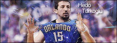
Post by Urias13 on Apr 28, 2007 17:53:58 GMT -5
I think that the blue text works better. The white text kinda blends with the background and Fox's eyebrow. . .at least I think it's his eyebrow.
|
|
|
|
Post by Capton Tenacious on Apr 29, 2007 10:52:53 GMT -5
Nice job! How did you make that background?
|
|
|
|
Post by Deadlymushroom on Apr 29, 2007 12:11:08 GMT -5
Nice job! How did you make that background? If you are talking about the fox sig, then... I took two big pictures of the render and put them in the back. I put one on overlay, and for the other, I guassianed blurred it to about 20 or 25 and set it on multiply. Then, the red and orange stuff is a C4D I set to normal. I used the path tool to create a path, stroked it a light blue at about 5 pixels, and then white at about 2. After that, I used the consolve tool to smooth some of it out. The lighting was simple, and I displaced some sparks in the top left corner and set it to a low opacity. Easy as that. |
|
|
|
Post by Capton Tenacious on Apr 29, 2007 16:36:56 GMT -5
That 50-step procedure dosent seem very easy to me....  Anyway, It looks very good. ;D |
|
|
|
Post by sykoe on May 15, 2007 2:11:31 GMT -5
The two unfinished ones don't really seem to be any good, the renders aren't the centre of attention, the background is, and they look a little weird. Other than the first two, though they're really, really good.
|
|


 (used elsewhere)